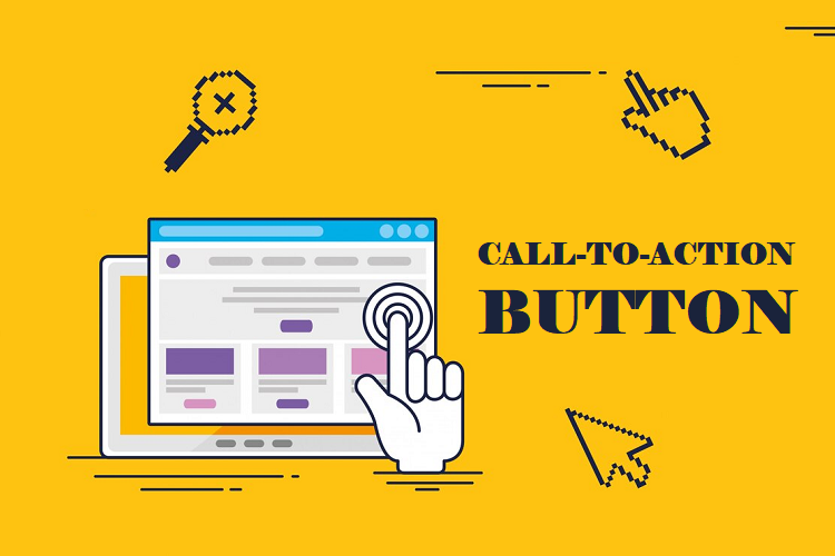
The success of your website might be determined by the small rectangle that is the call to action (CTA) button. It’s the last push, the warm greeting that directs visitors to take whatever action you want them to do—buying, signing up for a subscription, or interacting with you more.
However, creating a compelling CTA button involves more than just placing a bright button on your page and waiting for people to click. It involves carefully combining design, psychology, and user experience. We’re going to delve deeply into the world of CTA button best practices, so fasten your seatbelt!
CTA Button Best Practices for Higher Conversions
1. Persuasion Psychology
Before discussing pixels and fonts, let’s examine the human factor. What draws individuals together?
- Urgency and Clarity: If you confuse them, you will lose them. You should be very clear in your CTA wording about the action you want customers to perform. Use phrases like “now,” “today,” or “limited time” to accentuate the impression of urgency and scarcity.
- Worth Proposition: What makes them click worthy? Emphasize the advantages that users receive from the action. Give a hint of the value your good or service provides, but don’t stop there.
- Social Proof: People believe in the experiences of others. To foster trust and motivate action, highlight customer reviews, testimonials, or social media references related to your call to action.
- FOMO (fear of missing out): Never undervalue its influence! Clicks can be motivated by limited-time incentives, exclusive content, or early access that piques one’s desire to not miss out.
2. Click-Friendly Design
Let’s now customize your CTA button to better convey its compelling message:
- Color Psychology: Emotions are evoked by color. Employ contrasting hues that complement your brand identity and make a statement against your surroundings. Action is typically prompted by the colors red, orange, and green, but try different colors to see what your audience responds to best.
- Placement and Size of Buttons: Avoid making people search! Choose the appropriate size and position to make your CTA stand out. Think about placing content above the fold, toward the conclusion of a page, or even in many locations for longer pages.
- Clarity and Conciseness: Write a succinct, pleasant CTA. Make use of powerful verbs and the active voice (like in “Try it now” as opposed to “Learn more”). Aim for immediate comprehension and readability.
- Visual Hierarchy: To make your CTA stand out and grab attention, use design elements like borders, whitespace, and shadows.
3. Conversion-focused Optimization
Recall that the most effective CTAs are dynamic. Your friend is A/B testing:
- Try Different Versions: See what works best for your audience by experimenting with different CTA designs, colors, text changes, and positions.
- Monitor and Examine: Utilize analytics software to track click-through rates (CTRs) and determine the factors that influence conversions.
- Iterate and Refine: Refine your CTA’s messaging and design in light of your statistics to ensure ongoing progress.
4. Complex CTA Strategies
All set to pass the next level? Here are some expert pointers:
- Personalization: For a more tailored experience, employ dynamic call-to-actions (CTAs) that alter in response to user data or behavior.
- Motion and Microinteractions: You can highlight your call to action (CTA) and add mystery by using subtle animations or hover effects.
- Scarcity and Urgency: To instill a sense of urgency and motivate quick action, use countdown timers, limited supplies, or progress bars.
- Fear of Regret: To gently persuade consumers to click, emphasize the possible drawbacks of doing nothing.
5. Recall the Context and Look Past the Button
While important, the CTA button is hardly a miracle worker. Recall:
- Clear Value Proposition: Before requesting action from visitors, make sure your website conveys your value proposition.
- Flowing User Experience: Create a user experience that flows and guides users to your call to action.
Remove all barriers that could prevent users from carrying out the intended action to eliminate friction.
6. Microinteractions: Delightful Details that Drive Action
Utilize micro interactions instead of static buttons. These are quick, fun animations or replies that happen when consumers connect with your call to action. These small details improve user experience, increase interaction, and gently nudge consumers in the direction of conversion.
- Effects on Hover: Modest adjustments to a button’s size, color, or movement can draw attention and indicate interaction.
- Progress Bars: Keep consumers interested and lower abandonment by visually representing the download or action completion process.
- Confetti Animations: Commemorate accomplishments with joyful animations to start a positive feedback loop.
7. Gamification: Using Play to Make Tasks More Enjoyable
Your CTAs can become more engaging by including gamification features to turn routine chores into fun experiences. Provide rewards such as points, badges, or leaderboards to motivate users to engage and advance through your intended actions.
- Assessments and Quizzes: Provide users with customized findings and calls to action depending on their responses in interactive quizzes.
- Spin-to-win Promotions: Use gamified discounts or prizes to increase enthusiasm and involvement.
- Bars of Progress Featuring Gamified Elements: To encourage users to cross the finish line, combine progress bars with incentives like points or prizes for finishing each step.
8. Customization: Adapting the Call to Every User
It’s over for generic CTAs. Accept dynamic CTAs that adjust the message according to the activity or data of each unique user. As a result, click-through rates rise since the user experience is more engaging and relevant.
- Location-based CTAs: Provide offers or calls to action that are specific to the user’s location to compel them to act right away.
- Prior Acquisition History: Provide recommendations for goods or activities based on previous purchases, promoting a feeling of personal comprehension.
- Targeting Behavior On-site: Show CTAs that are relevant to the user’s journey through your website and point them in the direction of the appropriate next steps.
9. FOMO and Scarcity: The Influence of Limited Supply
Draw attention to time-limited deals, restricted supplies, or special access to increase conversions.
- Countdown Timers: Putting up a countdown timer during a promotion or offer makes customers feel compelled to buy right away.
- Notifications of Limited Stock: Inform users of products’ limited supply and encourage them to act before they run out.
- Pop-ups with Exclusive Access: Create a sense of luxury by rewarding users who act within a time restriction with discounts or exclusive content.
10. Data-Driven Optimization & A/B Testing: Ongoing Improvement
Data-driven CTA tactics are the most effective. Keep running A/B tests to find the button versions, messaging, and placements that work best for your target demographic.
- Examine the Design Aspects of the Button: To determine which works better, compare the hover effects, color, size, and shape.
- Try Special Reproduction Variations: To maximize click-via charges, test with various CTA text lengths, verb tenses, and cost propositions.
- Monitor User Movements: Examine how users engage along with your name-to-movements (CTAs) to learn about their selection-making technique and pinpoint areas that want development.
Recall that developing your CTA skills is a continuous process. These cutting-edge techniques may be used with data-driven optimization to create CTAs that not only draw people in but also smoothly direct them toward the activities you want them to take. Allow your buttons to act as silent salespeople, working nonstop to turn clicks into devoted clients and support the expansion of your company.
11. Testing and Improvement: The Process Never Stops
It’s untrue to find the ideal CTA button. Users’ tastes and behaviors change with time, so don’t be scared to try new things. To determine which version of your button performs better, compare them using A/B testing. To gauge your progress, keep an eye on indicators like conversion rate and click-through rate (CTR).
12. Recognizing Your Audience: The Key to Success
Before designing, keep in mind that your audience should benefit from your call to action, not the other way around. It’s critical to comprehend their wants, needs, and sore spots. Examine their online habits, objections frequently raised, and demographics. Consider this:
- What do people want to find on your website?
- What spurs them into action?
- What qualms may they be having?
You can create a CTA button that appeals to their needs directly and presents an irresistible solution by answering these questions.
13. Niche Approaches for Particular Sectors
- E-commerce: Provide a variety of payment methods and incentives for free shipment.
- SaaS & Subscriptions: To lower perceived risk, highlight free trials or demos. Use time constraints by offering exclusive early access or limited-time trial offerings. Display endorsements and user success narratives.
- Lead Creation: Provide useful downloading materials, such as whitepapers or ebooks, in return for contact details. Make use of audience-specific lead magnets. Make sure your forms are mobile-friendly and brief.
- Donations & Nonprofits: Make use of emotional stimulants like compassion and empathy. With monthly giving choices, you may encourage recurring gifts. Share moving anecdotes and beneficiary testimonials.
14. Trends to Watch in CTA Optimization
- Interactive CTAs: To engage consumers and customize the CTA experience, consider utilizing micro-interactions like polls, quizzes, or chatbots.
- Voice-activated Call to Action (CTAs): As voice assistants become more commonplace, make sure your CTAs are search engines optimized for speech queries and that spoken commands can readily find them.
- VR/AR Integration: Try experimenting with virtual reality (VR) or augmented reality (AR) experiences to make immersive call-to-actions (CTAs) that transcend the conventional button structure.
- Emphasize Accessibility: Make certain your name-to-movements (CTAs) can be accessed by way of human beings with disabilities by adhering to the WCAG standards and using appropriate keyboard navigation, alt textual content, and shade contrast.
15. Measuring Real Success with Metrics Beyond Clicks
Even as the click-through fee (CTR) is a useful indicator, you shouldn’t base all of your evaluation on it. To have a more comprehensive understanding of the efficacy of your CTA, don’t forget the following metrics:
- Conversion charge: The share of users who click the decision to motion (CTA) and then end the preferred motion. The period spent on a page when a consumer clicks a name to action. This is the percentage of visitors to your web page who leave after clicking the call to move.
- Form completion price: Indicates how properly the CTA-associated paperwork is running. Customer lifetime fee (CLTV) measures the total value that a consumer contributes to your corporation throughout their courting.
16. Advanced Techniques for Designing Buttons
Take into account these sophisticated methods in addition to the fundamentals of design to make your CTA stand out:
- Microinteractions: To improve engagement and aesthetic attraction, add minor animations or sound results whilst the consumer hovers over or clicks.
- Button Gradients & 3D Effects: To make a button that is greater visually arresting and cutting-edge, use diffused gradients or 3D outcomes.
- Shapes & Icons: Play around with diverse shapes and icons to attract interest for your emblem and beautify your logo identity.
Conclusion
Improving your call-to-action buttons is an ongoing process. You can transform your call to action into a conversion engine that drives sales and advances your company by getting to know your audience, implementing these cutting-edge techniques, and iteratively testing and improving. Recall that the ideal CTA is constantly changing, therefore to achieve even greater success, welcome experimentation, collect data, and never stop pushing the envelope.
Commonly Asked Questions
1. How frequently should my CTA button be changed?
There isn’t a single solution that works for everyone, but it is imperative to test and iterate often. Every two to four weeks, think about A/B testing various iterations and evaluating changes in light of your objectives and traffic numbers. Keep your call to action (CTA) current and relevant by keeping up with design trends and user behavior.
2. How can I handle a website with several CTAs? Are they able to clash?
Unexpected CTAs can indeed mislead consumers. Sort your primary CTA according to its size, clarity, color, and placement. When using secondary CTAs, consider the various user segments and stages of the buyer journey. Make sure that no CTA is vying for the attention of others; instead, each should have a clear objective.
3. My spending is limited. What are the most effective methods for CTA optimization?
Start by A/B testing the current design and copy of your CTA. Modifications as minor as the color or language of a button can have a big impact. Without spending a lot of money on software, use heatmaps and click-tracking tools to find places that need work. Utilize social proof and user reviews to establish credibility without spending extra money.