Are you looking for advanced tools to convert your data into interactive reports and dashboards for making decisions? With the rise in technological innovation, a large amount of real-time data is generated by various industries daily.
In this case, these data are unorganized, unstructured, and scattered, which is challenging and complex to understand easily for making informed business decisions.
Impact of Power BI Visuals for Extracting Information from Large Data Volume
For this purpose, Microsoft provides the modern solution in the form of dedicated technology like Power BI solutions which will extract and convert these big data into interactive and engaging visual reports that are easy to understand and make decisions.
In addition, humans can quickly grasp the information for a longer time in visual forms compared to the complicated data volume in text and numbers. However, Power BI visuals are essential features to showcase a large volume of data in visual forms.
Hence, for every business and industry, the Power BI tool will be considered an excellent BI solution for making informed decisions and predicting the future analysis of business processes to take precautions to prevent huge financial loss.
Popular data visualization tools like Power BI are equipped with numerous visual reports, interactive reports, and engaging dashboards based on the data. For this crucial reason, every industry or business must use Power BI visuals to extract the essential information from the large pile of data.
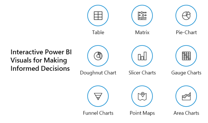
Interactive Power BI Visuals for Making Informed Decisions
Let us deep-dive into the different types of Power BI visuals to generate interactive, engaging, and attractive reports based on big data.
1. Table
The table format of Power BI visuals is used to showcase two-dimensional data for easy grasping of data. For instance, this Power BI dashboard is utilized for quantitative comparisons to compare and visualize data and exact values.
This agency wants to analyze their monthly sales of clothing or fashion wear. However, they can use the table format of Power BI visuals to compare monthly deals by inputting the month name in one column of the table and the total number of sales in that month. For example, consider a situation to extract the data of the clothing company based on the monthly sale of the clothes.
In addition, they want to compare the sales of the last year and the current year of clothing products. Therefore, the table shows these data side by side and uses a conditional formatting function to watch the clothing sales increase and decrease based on each month of the year.
In addition, they can also compare the total number of sales in the same month of two years, and it means the last year and the current year. In this manner, the unorganized clothing product sales data gets converted into an interactive visual report for easy understanding and future informed decisions for better productivity and sales.
2. Matrix
The power BI developers utilize the matrix visual format to operate and process the three-dimensional (3D) data and multiple dimensions. However, the matrix visual form is like a table, and the best example is the pivot table.
However, the matrix format is ideally utilized to represent two or more variables in a data set. Also, it shows the relation between all these data sets and uses rows and columns for data representation in the grid form.
Let us take a short example to understand the matrix Power BI dashboard. For instance, the data set comprises the student’s marks in multiple subjects like Maths, Science, Social Science, English, Computer, Sanskrit, Hindi, Gujarati, etc.
For this purpose, the teachers and educational institutes will use the matrix format of Power BI visual type to enter the student’s marks for all subjects in preparing for final exam results. In contrast, the table visual report format cannot give the desired results. It is difficult to grasp the information from multi-dimensional data sets to make the final decision.
3. Pie-Chart
Pie-Chart is one of the most popular Power BI dashboards and visuals used in numerous industries and businesses for data interpretation like education, communication, business world, marketing, and more.
Using this visual report, the pie chart divides the whole data into multiple slices and shows each data’s numerical propositions. Besides, the pie chart is circular, representing the statistical data in different parts. So, each section of the pie chart describes the percentages, and the total sum of all the portions should be 100%.
For instance, various businesses use these engaging pie charts for data representation and interpretation of the same category. In addition, users will understand the data quickly in the form of a pie-chart visual.
For instance, the marks of students in different subjects. Moreover, the same data gets converted into a highly engaging and attractive visual report using a pie chart.
4. Doughnut Chart
The doughnut chart form of the Power BI dashboard is the most famous and attractive visual report for easy interpretation of data. However, this Power BI dashboard looks like doughnuts as the hollow circle inscribed on it. In contrast, the doughnut chart looks like a pie-chart form, but its shape includes the hollow circle at the center of the graph.
For instance, this visual report is utilized by organizations who want to grasp the data properly because the doughnut charts represent the complete information or data sets as a proposition. Also, it is the most popular interactive and engaging visual report when users want to display different proportions that make a final value.
For example, the analysis of the latest software programming technologies trending nowadays from the proposition of 100%. Hence, users can get an overview of all the trending software programming methods like Python, C#, C programming language, Java, PHP, ASP.NET, and more.
5. Slicer Charts
Slicers from the Power BI visuals will act as a filter, and it gets utilized in filtering the data sets that comprise more parameters. For instance, Power BI developers will use these visual tools to switch between months, years, and similar data sets. In some situations, many companies and organizations require sorting and filtering the large data volume by selecting the data and clicking on it.
For example, some organizations want to take an overview of sales and marketing of products for only one month in a yearly sales record of products and services. In this manner, Power BI offers flexibility to users in the form of a slicers chart to sort and filter the required data from the large data sets.
6. Gauge Charts
Gauge charts are one of the interactive and engaging Power BI visuals type that looks attractive, like a bike’s speedometer. In addition, it is semi-circular in shape and looks like a dial chart that represents data which requires the minimum value, maximum value, and the targeted value.
For seamlessly showcasing the data, it uses the needle to represent the practical value and shows the dial’s information. For example, these visual reports are helpful for data representation like the credit card department and showcase the minimum target for credit card sales, maximum card sales, and the target achieved by the credit card sales executive of a bank or other financial institutions.
However, the gauge chart helps represent the value of each needle and reads the sales data using different coloured areas and on the axis. In addition, these types of charts are helpful for organizations that want to compare the values between the variable data through multiple needles on the same gauge charts or multiple gauge charts.
7. Funnel Charts
Funnel charts are the type of Power BI visuals that look like a funnel used to pour liquid items into the bottle. For instance, this type of Power BI dashboard is utilized by the companies or organizations who want to represent their data in numerical proportions.
However, this chart is helpful for data representation that flows from one phase to another. In addition, the entire proportion of the data in the funnel chart is assumed to be 100%.
For example, the marketing department uses this funnel chart that converts the total number of customers into the potential leads in 100% proportion.
The total number of leads in a day is 350, divided into the solution leads, proposal leads, and finalized leads based on the marketing campaign organized by the consumer electronics company.
8. Point Maps
This point maps visual tool is used for data representation related to the geographical area or spreads its effect across the globe. The Power BI solution provider plots the exact size of points on the large volume of data related to various locations. In addition, it becomes easier and simple for users to understand the data spread across different geographical areas.
In contrast, it becomes difficult to understand the data distribution over the specific location in detail. For example, the point maps visual dashboards help generate weather reports, population status, temperature measurement, and more to distribute the data over multiple geographical locations.
9. Filled Maps
The filled maps are a Power BI visual type like the point maps, but a slight difference makes them distinct from other interactive dashboards. However, this visual report will use the colours and their different shades to represent data distributed all over the geographical locations.
In addition, this filled map shades areas based on the proportions of the numbers displayed in the measurements. It is helpful for organizations that want to analyze the sales data of location in which it gets maximum and the lighter shades to represent the location with fewer product sales.
For example, these Power BI visuals are highly essential to the companies or organizations who want to make business decisions based on geographical locations. In addition, they can also utilize to compare multiple groups like the electronic products that are popular across different areas worldwide.
10. Area Charts
The area charts are a slight modification of the line chart visual reports. Also, it fills the line graphs with different colours in the entire area across the lines and axis. In addition, it collects the data volume and represents them in a plane that showcases the changes in your variable data over time.
However, the lines on the area chart graph are generated by joining all the different points of the data volume. For example, the area charts are popular among companies that measure the latest fashion trends over a specific time.
Therefore, it is efficient in predicting the future fluctuations in commodity pricing and interest rates and making informed financial decisions.
Interactive Reports Using Power BI Visuals
In the digital era, different businesses and industries generate a huge pile of data daily. But they are searching for dedicated automated BI solutions that can transform these unorganized data into attractive, engaging, and interactive dashboards for easy understanding and to make informed decisions.
So, suppose you want to take benefit of these interactive visual reports like impressing your boss or making vital business decisions to avoid various risks. In that case, you can chat with Microsoft Power BI consultant that offers the perfect BI solutions based on your business requirements.
Also, a large team of Power BI developers helps to create highly immersive, engaging, and interactive reports after a detailed analysis of your data and business needs.